UX strategy to drive supporter engagement for leading UK mental health charity
Mind
Revitalising Email Marketing
Mind came to Wonderful to translate their brand refresh digitally through updated email marketing templates, with the aim of improving customer interactions and brand engagement through this key digital touch point. Dated and underperforming, the existing template structures needed a full UX overhaul, consolidating fragmented email comms into one unified strategy and set of consistent, recognisable and appropriate templates driving a range of desired actions and functions.
Unified Engagement
As with many other charities we’ve worked with over recent years such as Glaucoma UK and RBLI, projects like this feature multiple stakeholders, from multiple departments across events, fundraising, volunteering, policy and as in this instance, different territories (Mind England and Cymru).
Our challenge was to not only translate the new digital brand identity and enhance the performance and usability of the templates, but to distil the range of needs and desired actions by each of these key stakeholder groups into a manageable set of outcomes to ensure the improved performance was across all departments and did not favour or prioritise one action over others.
Streamlined and Impactful
To achieve the challenge, Wonderful ran a range of workshops, alongside user mapping to consolidate into a set of unified templates which could be used by all departments for a range of desired functions.
From newsletters which drive sign-ups to volunteering opportunities; to bulletins prompting donations; and campaigns making it simple for people who suffer with their mental health to find information and get the help they need, the emails had to make it as simple as possible for the Mind team to drive results.
Enhanced Engagement and Impact
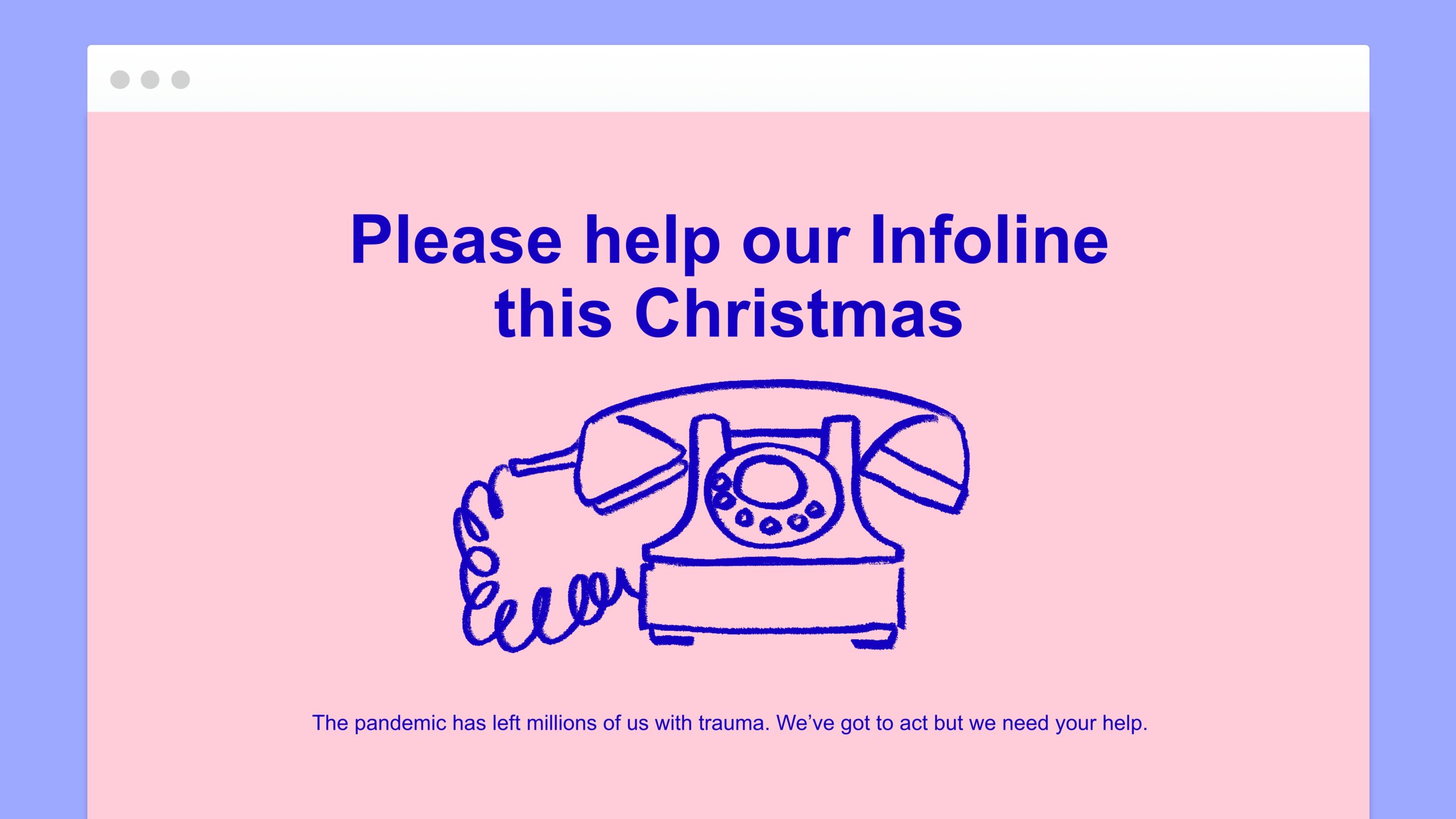
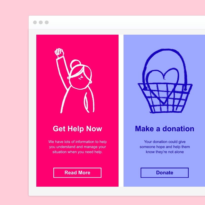
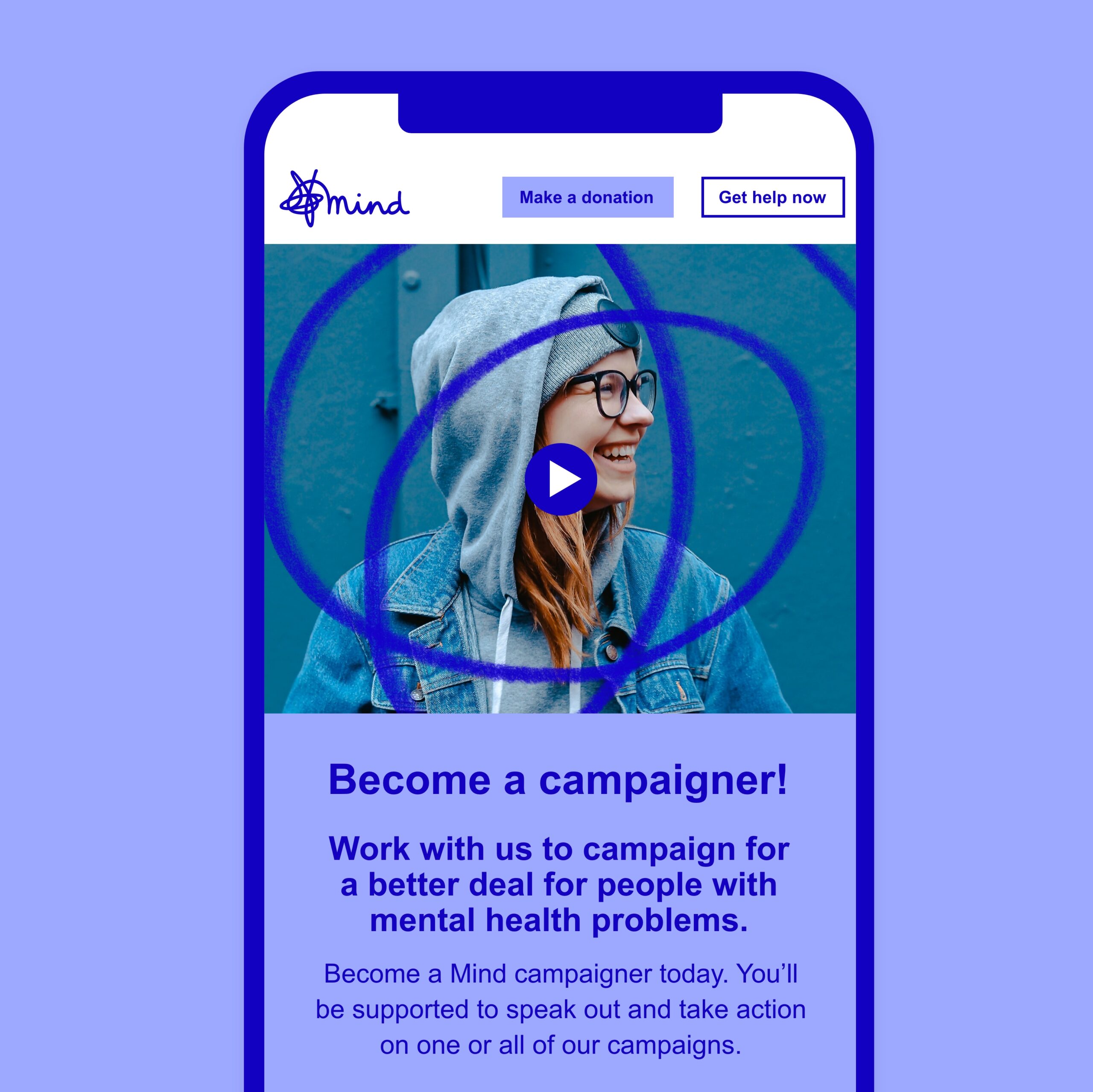
Our UX specialist worked in collaboration with our Digital Marketing and Development Teams, a total of five specific templates from ‘Newsletter’ to ‘Get Involved’ were created in five different colourways (aligned to the different energies from the brand refresh) in English, Welsh and Multi-Language. The designs were both visually appealing and functional, maximising the value of Mind’s supporter contacts with clear calls to action and defined goals.
To complete our solution, we also worked to import these coded templates into the DotDigital platform, troubleshoot the platform’s translation of the code, and train the team on best practice, to ensure they were used to full effect and delivered the desired impact from increased donation conversions to people being able to find mental health help and support easier than ever before.
