Highly accessible website for leading UK charity
Glaucoma UK
Elevating User Experience through Accessible Design
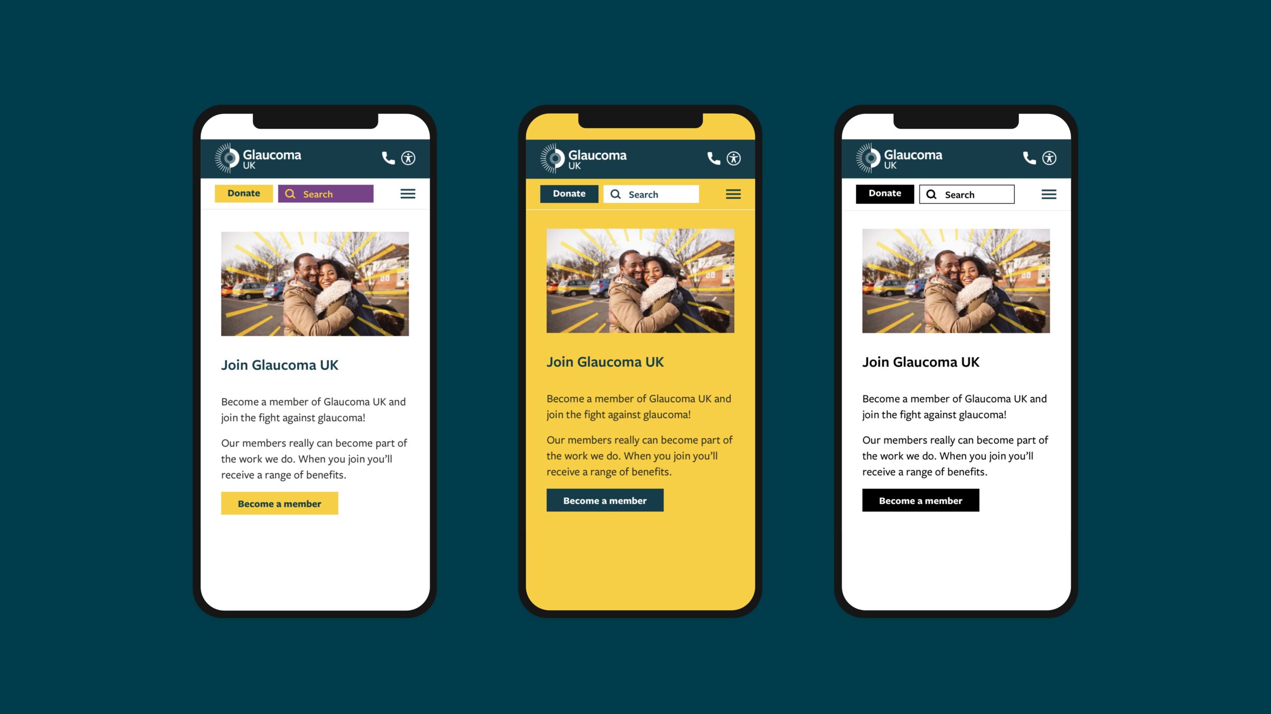
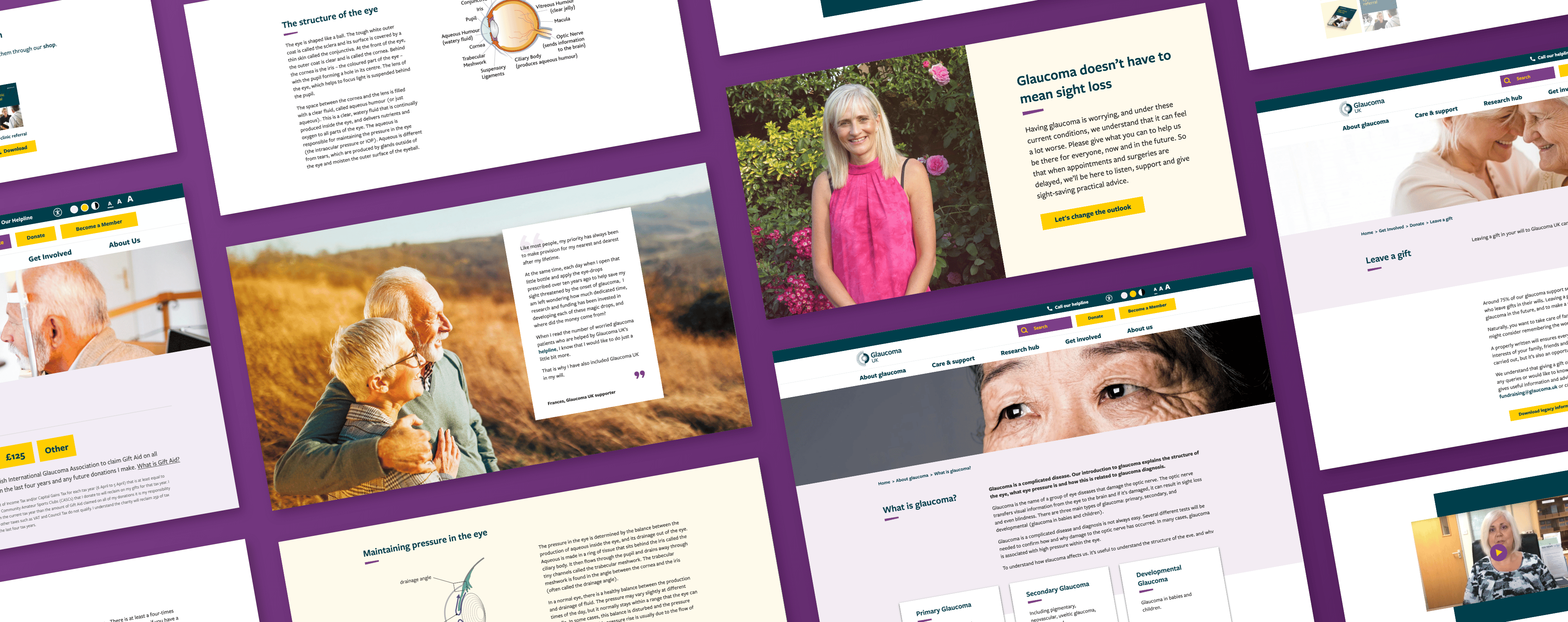
After a rebranding exercise, Glaucoma UK needed to build a new website which not only maintained the highest level of accessibility for their target users, but improved and enhanced the user experience based around their newly defined stakeholder profiles.
Our UX exploration process enabled us to really get under the skin of this project by understanding each of the charity’s key stakeholder profiles in detail. Far from just supplying information to glaucoma sufferers, their digital presence has to inform and raise awareness by speaking to medical professionals, researchers, donors, volunteers, fundraisers and the press.
This in depth exploration, coupled with data, research and heat-mapping on their existing website gave the team a strong foundation from which to build out highly defined user personas and projected user journeys.
The redesign and redevelopment also had to take influence from integrations with existing legacy systems and processes, required by Glaucoma UK for managing their vital online fundraising. Our team went through exhaustive research with a range of third parties to ensure full integration with existing fundraising platforms and CRM systems, and to enhance and improve efficiency of the user journey wherever possible during these elements.
Collaboration
Collaboration is one of Wonderful’s key pillars, and the collaboration with third parties extended far beyond the platform and technology integrations. Throughout this process, Glaucoma UK were undergoing the development of their new brand with another agency partner, making it even more vital for us to work closely to ensure the brand identity and ethos were executed perfectly and carried through seamlessly in our designs.
Accessibility first
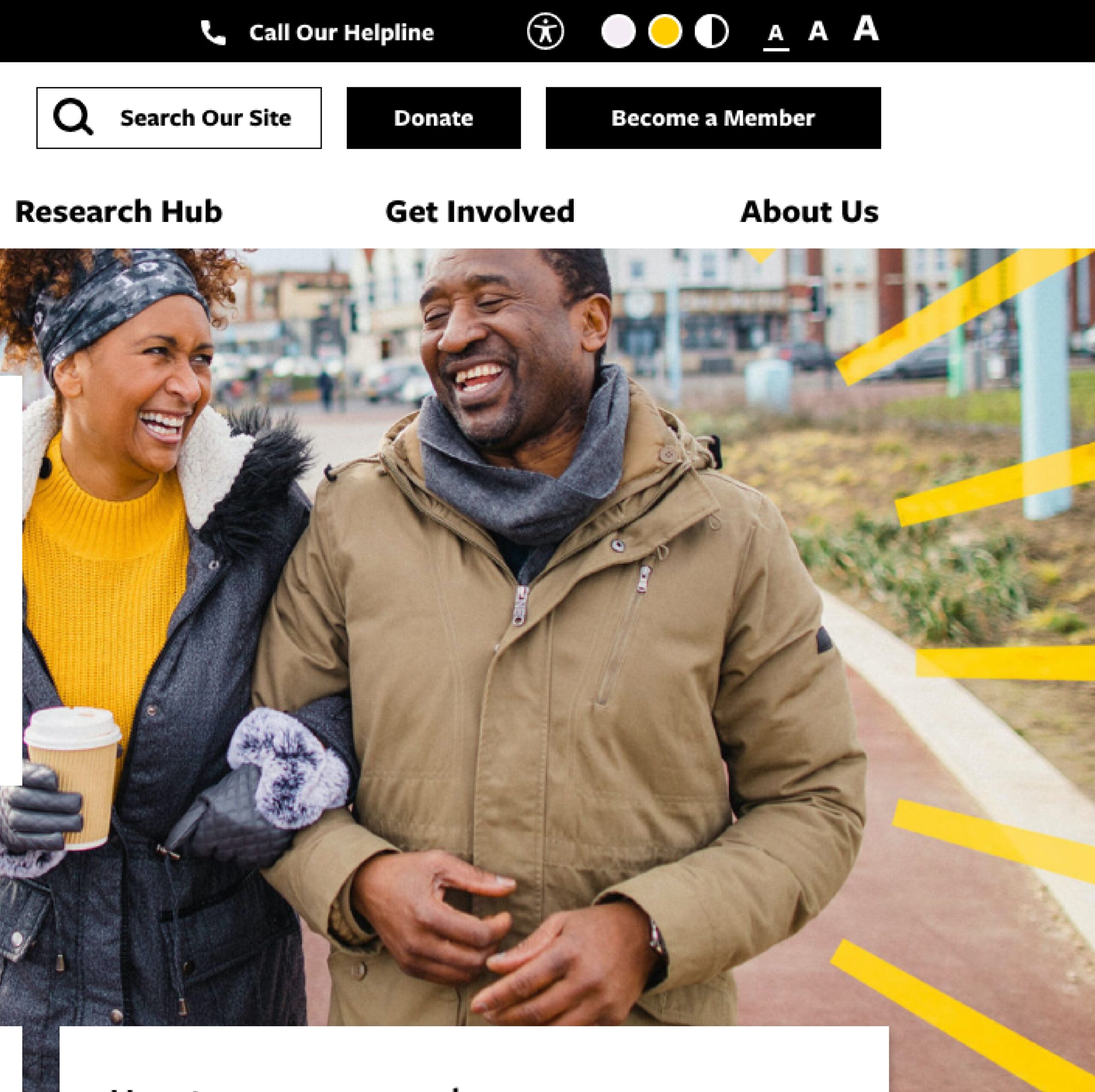
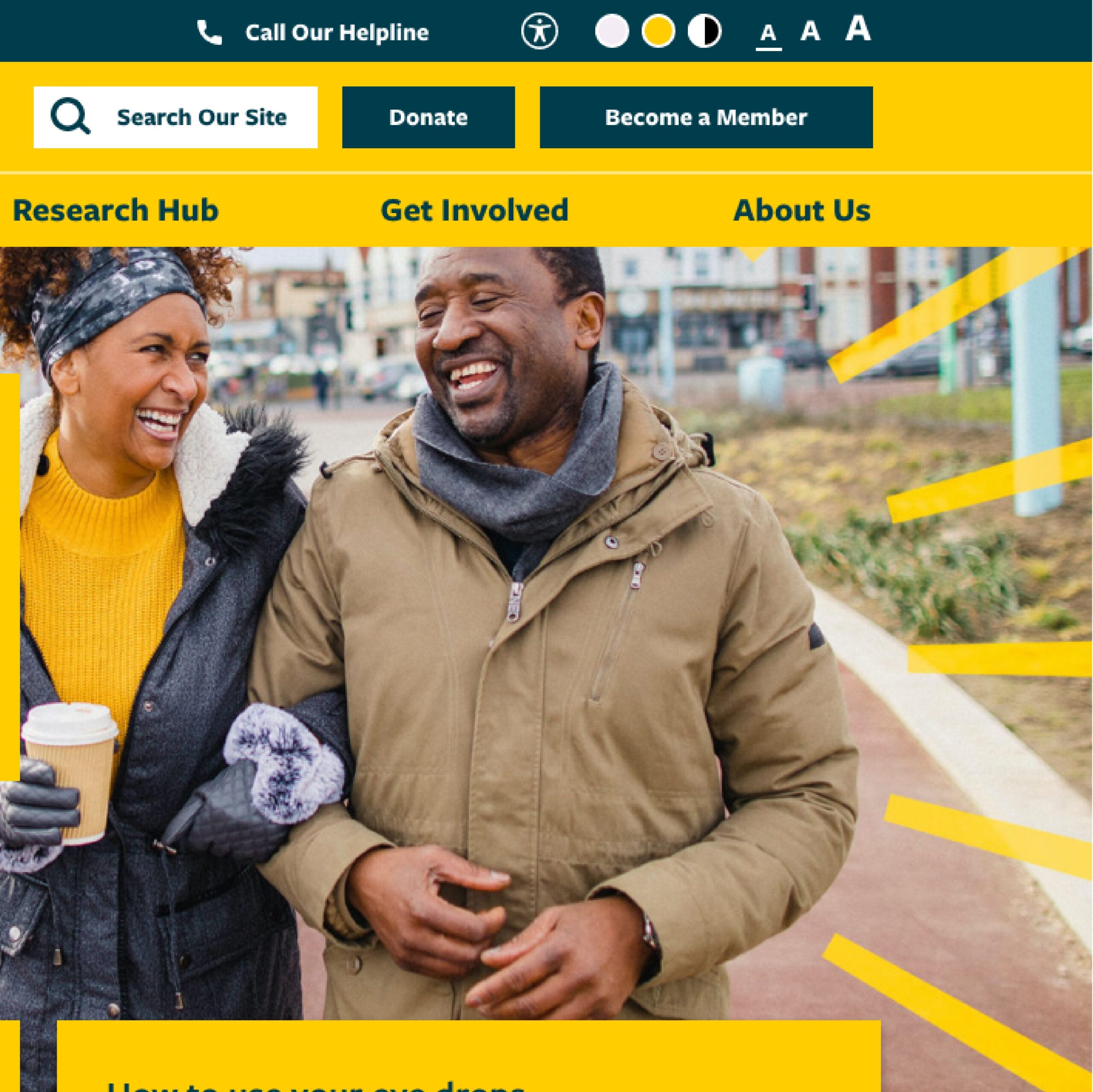
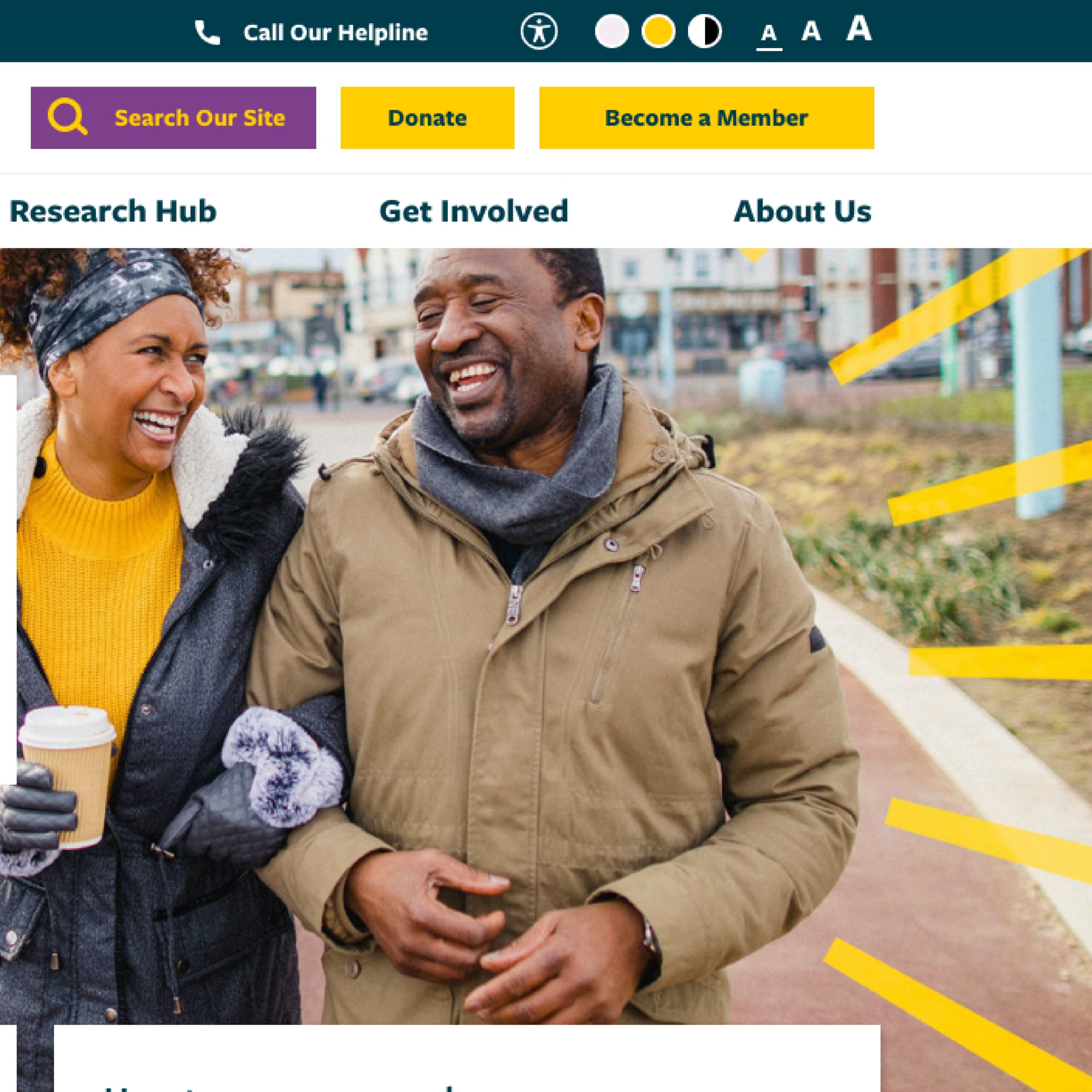
As with all websites, accessibility was important, but even more so when considering the target users are largely sufferers of the eye condition. As a result, navigation and on-page design had to be a priority when designing the site, meaning that high contrast and multi-size variants of each page has to be extrapolated from the root design at every step of the process.
Tangible Results
The improvements from the design and user experience enhancement, partnered with more robust goal tracking implementation manifested themselves in a number of ways.
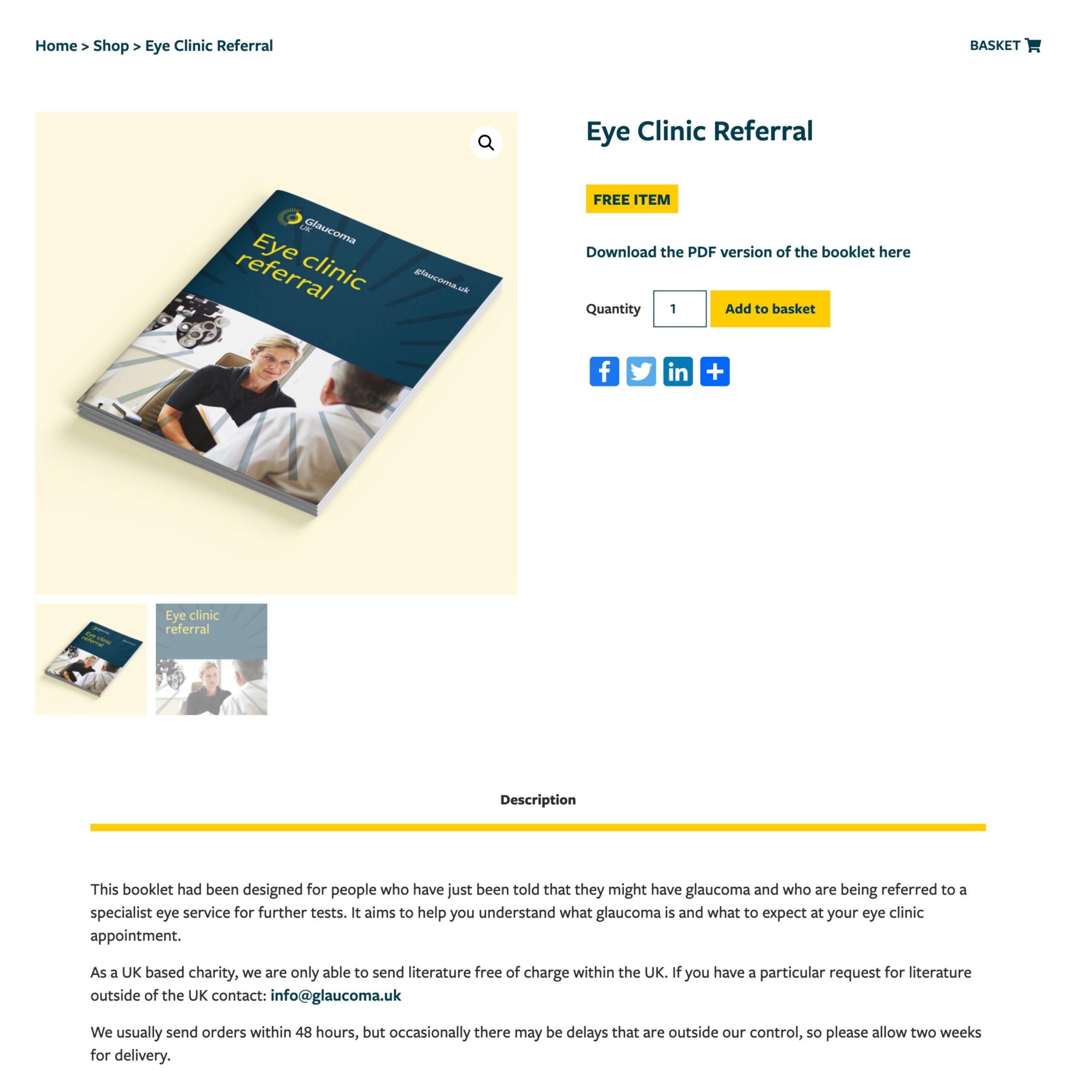
These include a 1300% increase in Goal completions recorded since the site was updated including contact form submissions, newsletter sign ups and downloads; traffic has diversified, with the site no longer relying predominantly on organic traffic to drive ecommerce – which has also risen by 92% compared to the previous period.
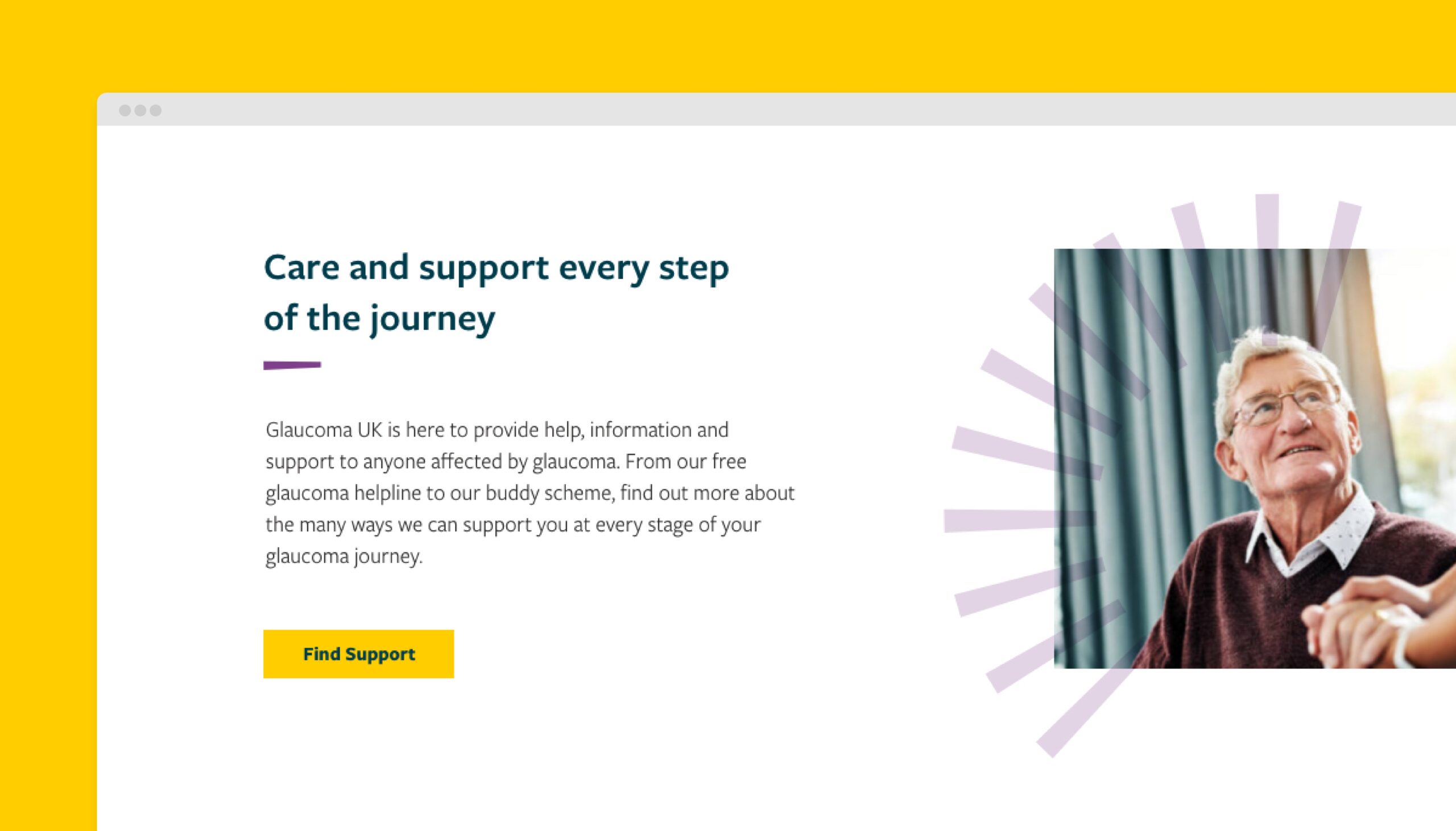
Pages per session have increased by 8.6%, and bounce rate reduced by 6.98% demonstrating a better user experience. New content and a focus on the UK has been highly successful, decreasing less relevant traffic from outside of the target country by around 90% (whilst also increasing traffic from the UK). Improved navigation has helped achieve much greater interaction with informational pages, including care and support areas as well as “About” and “getting involved” pages.
We were honoured to work with an organisation delivering such vital work. The new Glaucoma UK website design balances clearly presented information and accessibility with emotional imagery to make knowledge, support and advice as accessible as possible, even to those who are visually impaired users.
– Tim Howe, Account Manager
-
01
1300% increase in Goal completions
-
02
92% Organic traffic increase
-
03
Improved content interaction site-wide
